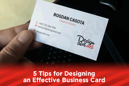
Every day, the business world moves closer and closer to going completely paperless. However, despite all of the innovation and technology which continues to move us forward, one item of the past will never go out of style: the business card. In fact, according to Adobe Blog, for every 2,000 business cards that get passed out, a company’s sales increase by 2.5%. No matter which type of professional you are, those marketing numbers are worth paying attention to.
Even so, take note: the actual design of your business card does influence its overall marketing effectiveness. For instance, the same Adobe article found consumers hang onto a colored card typically 10x longer than the standard white card. This means if you want your business card to turn into sales, then you must pay careful attention to how it’s created. Here are five tips for designing an effective business card.
1. Keep it simple.
When designing a business card, it’s easy to go overboard with ideas. You really want it to stand out, plus you have a lot of information to include. This mindset can quickly turn into a business card which is way too busy, too complicated and definitely not appealing to the average person. In this age of instant gratification, people want to know information as quickly as possible with as little fuss as possible. So, be sure to keep your business card design simple. Use one to three colors max, incorporate clean lines and straight edges and don’t get too crazy with the information included.
2. Use a bold design.
While keeping it simple, don’t be afraid to also use a bold design. It’s perfectly fine to incorporate unique colors or design ideas. By stepping outside of the box, you might actually catch someone’s attention and help turn the business card into a sale. For instance, try a nontraditional shape of the card, a textured paper or embossed lettering. Simple design features like these can make your card stand out from the pile, without over-complicating the process. And of course, remember to keep the bold design as simple as possible.
3. Have a large logo.
What’s the most important piece of information someone needs to receive from the business card? The business, of course! Grab people’s attention by making your logo the largest design element of the card. To keep it simple, use your logo as the basis for the entire design. How can the card work around the logo? What colors or design features complement the logo? By keeping these design pointers in mind, you can ensure anyone who sees the card will walk away remembering the business by the logo.
4. Include the essentials.
In accordance with keeping things simple, be sure the information on the card only includes the essentials. Incorporate your name, title, company name, address, phone number, email and website. Any other information is probably unnecessary and does not need to be on the card. As you go through the card design process, use a strict test to decide which information is absolutely pertinent to the consumer.
5. Make it legible.
Finally, make it legible. Seems simple enough, right? Unfortunately, many businesses get caught up in the creativity of designing a business card and forget someone actually has to be able to read it. Choose fonts which are professional, simple and easily readable for the average person. Anything more complicated will take extra time to read, and before you know it the business card will be tossed.
Even with today’s modern technology, a business card is still a powerful tool to have in your marketing belt. Keep these tips in mind as you design your next business card to make it more effective and help grow the business.
JOIN US!
Click here to subscribe to our mailing list if you would you like receive more helpful print related articles in your inbox every week.

